S&B FOODS GOLDEN CURRY
Package Design, Brand Design, Art Direction, Illustration, Typeface Design
Completed: Spring 2025
Package redesign project
print ready dieline
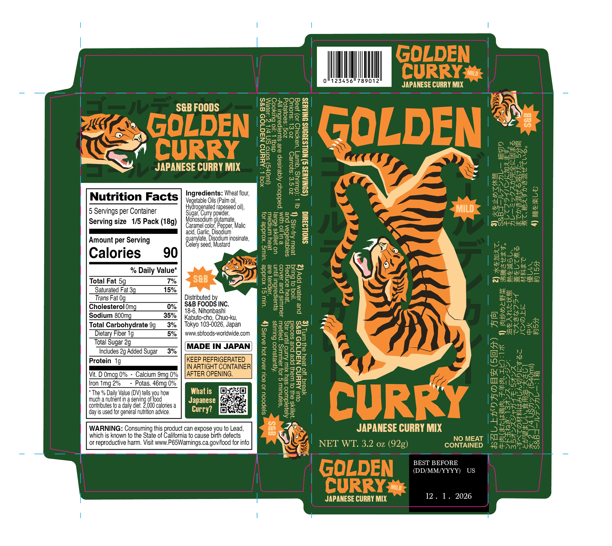
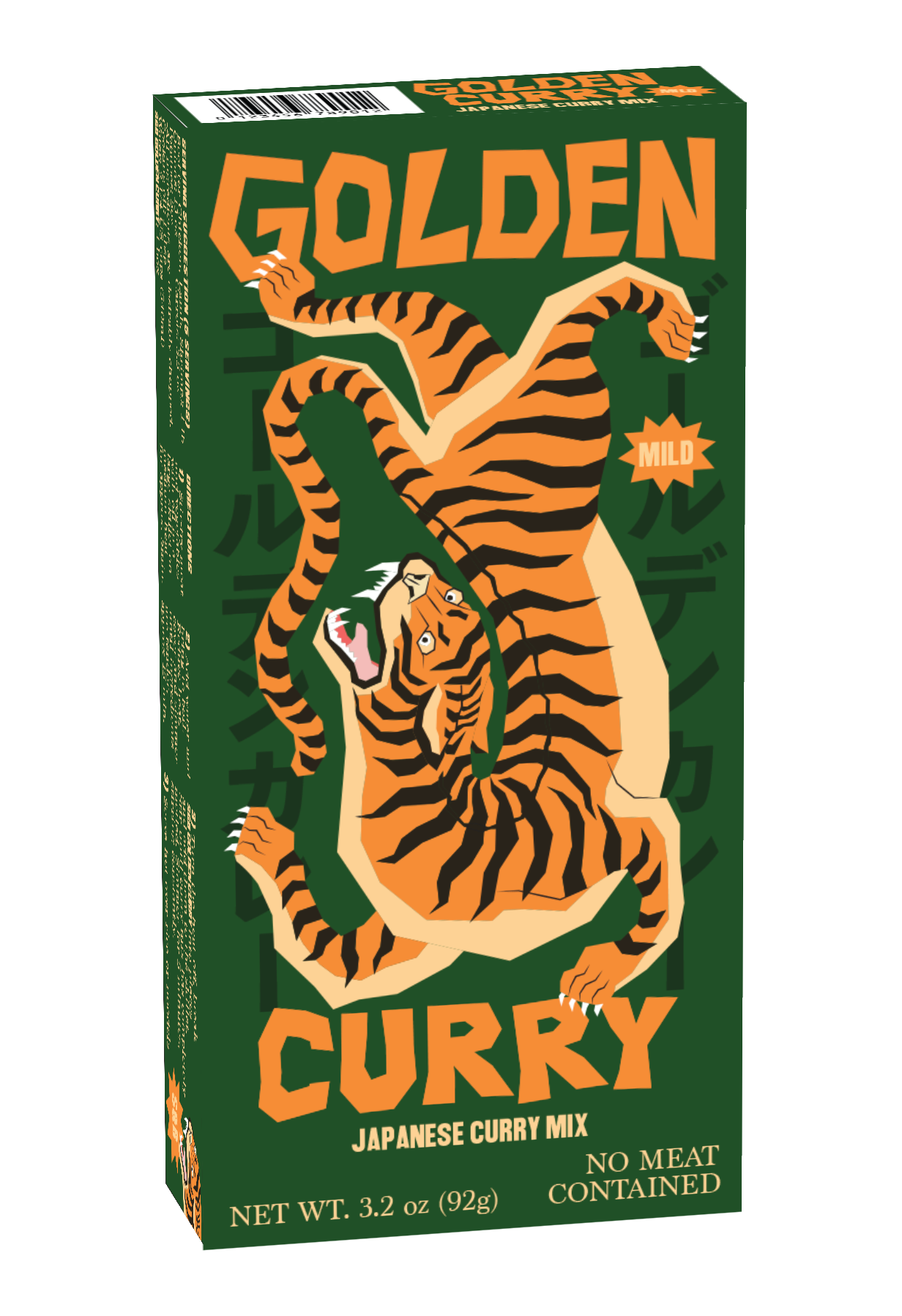
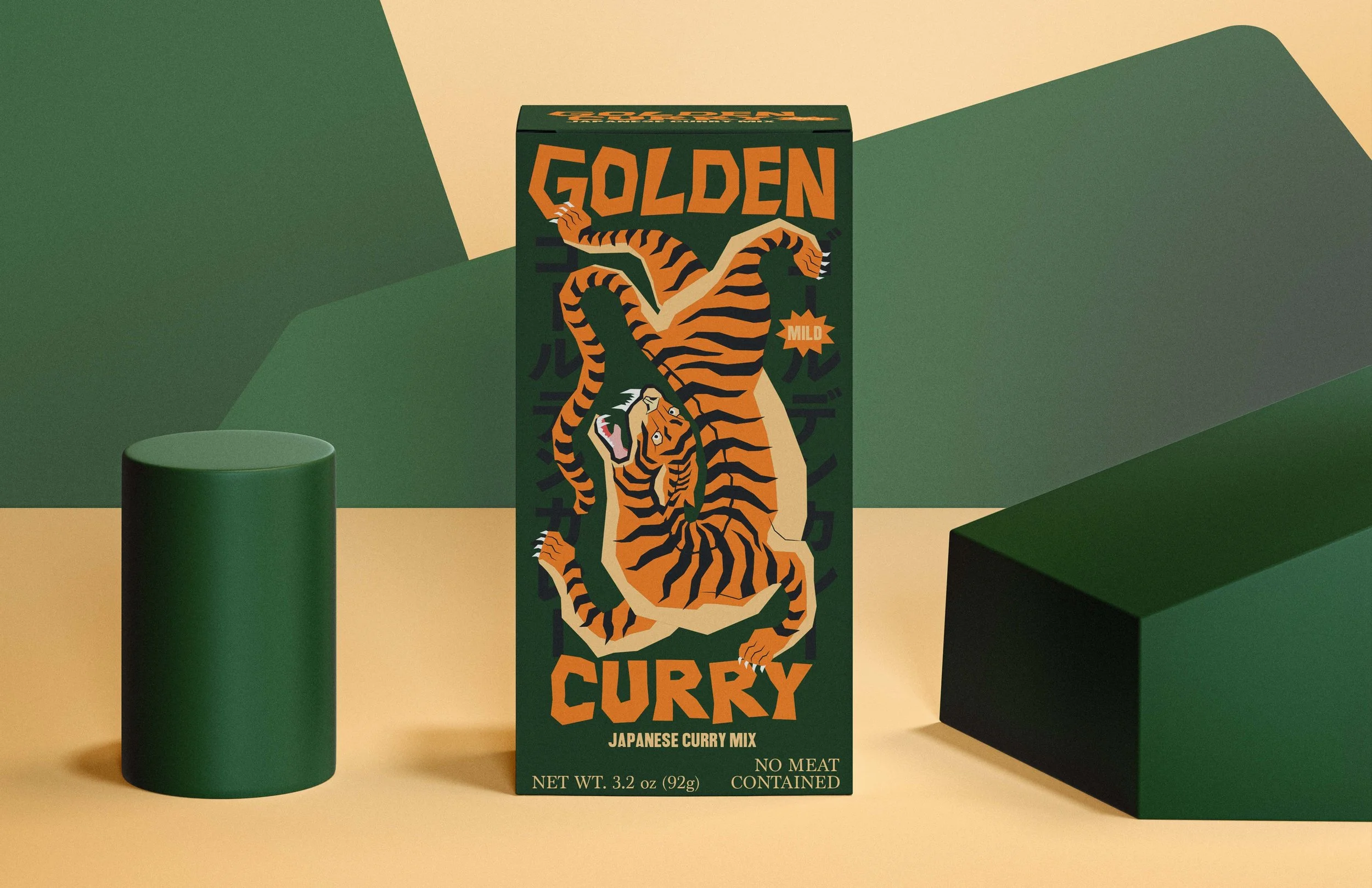
In this packaging project, I created a redesign for S&B Golden Curry, a Japanese curry mix. Interestingly enough, Japanese curry has quite a unique history. Originating in India, curry had been traditonally prepared for generations. During the expansion of international trade, curry became massively popular in what is now the United Kingdom. Then, in the late 19th century, the British Navy brought curry to Japan, where they put their own spin on it. So, with consideration for the intersection of three vastly different cultures, I created this design. I illustrated a tiger, an endagered animal from india that is commonly used in japanese traditonal tattoo artwork, in a simplistic, geometric style to encompass the modernization of western culture. Tigers are also symbolized by gold in traditional japanese and indian culture. I then created a cohesively geometric typeface for the words “golden curry”. In the background, there is “golden curry” translated to japanese, written in the traditonal vertical format. This design effectively translates the fusion of three different cultures with respect to the history of the artwork from each region. Absolutely loved making this design.
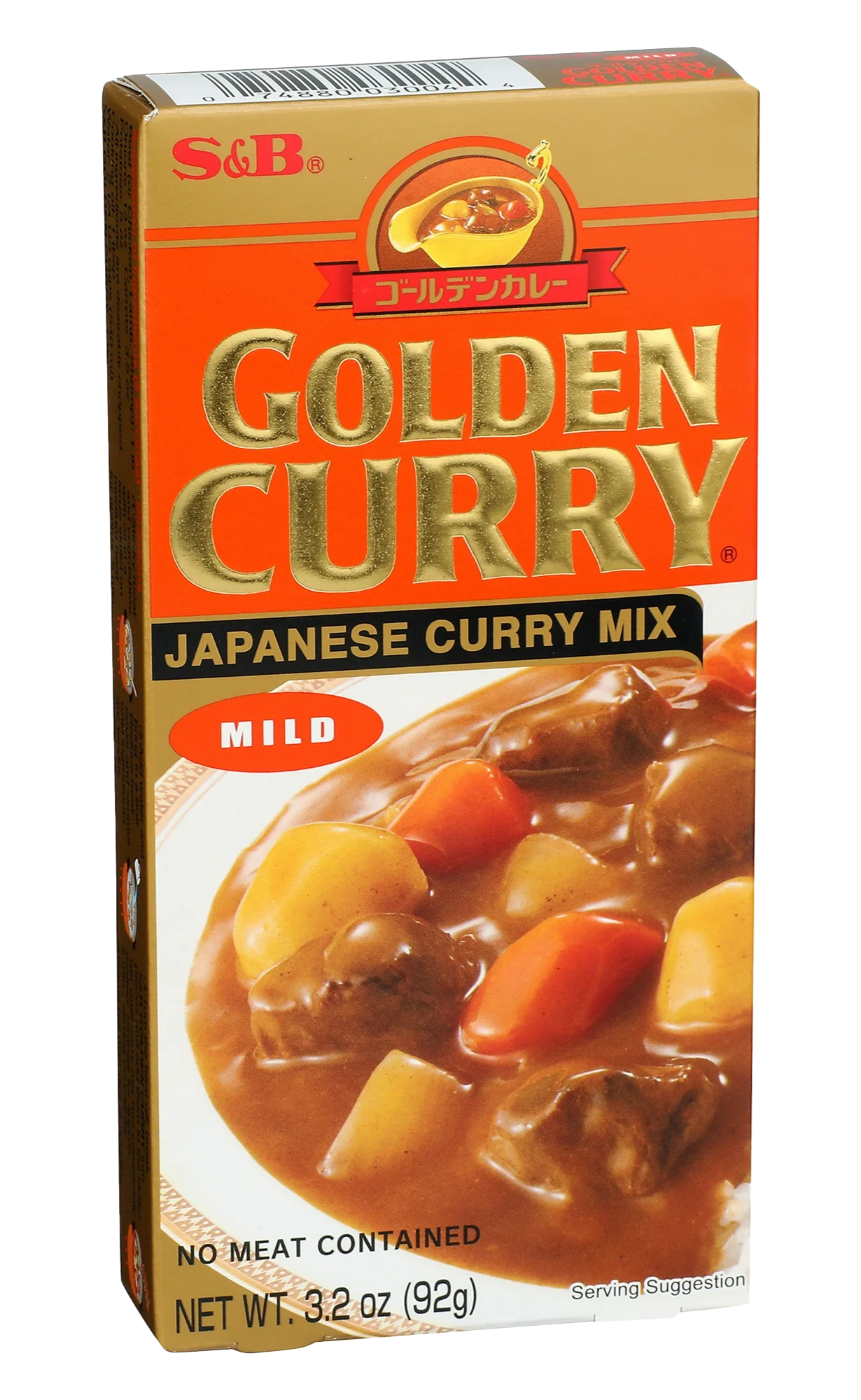
OLD DESIGN