
Great Value Foods
Branding, Package Design, Character Design, Information Design, Illustration, Concept Development, Art Direction
SENIOR CAPSTONE PROJECT
I. PROBLEM
Health is complicated.
HEALTH Is EXPENSIVE.
HEALTH Is STARTING TO FEEL OUT OF REACH.
It shouldn’t be.
II. RESEARCH
Grocery shopping is stressful for 73% of people.
People would like a guide to help better grocery shop.
Proper nutrition is more work than its worth.
Through surveys & interviews, we concluded:
III. GOAL
ALLEVIATE THE STRESS OF GROCERY SHOPPING.
SIMPLIFY HOLISTIC HEALTH AND NUTRITION.
IMPLEMENT PROPER NUTRITION INTO A GROCERY SHOPPING EXPERIENCE.
IV. PLAN
RESTRUCTURE FOOD PYRAMID TO THE HOLISTIC “HEALTH RAINBOW”
IMPLEMENT NUTRITION GUIDE INTO A REBRAND OF GREAT VALUE FOODS
CREATE PACKAGE DESIGNS FOR EACH HEALTH GROUP TO SIMPLIFY GROCERY SHOPPING EXPERIENCE.
PHASE I
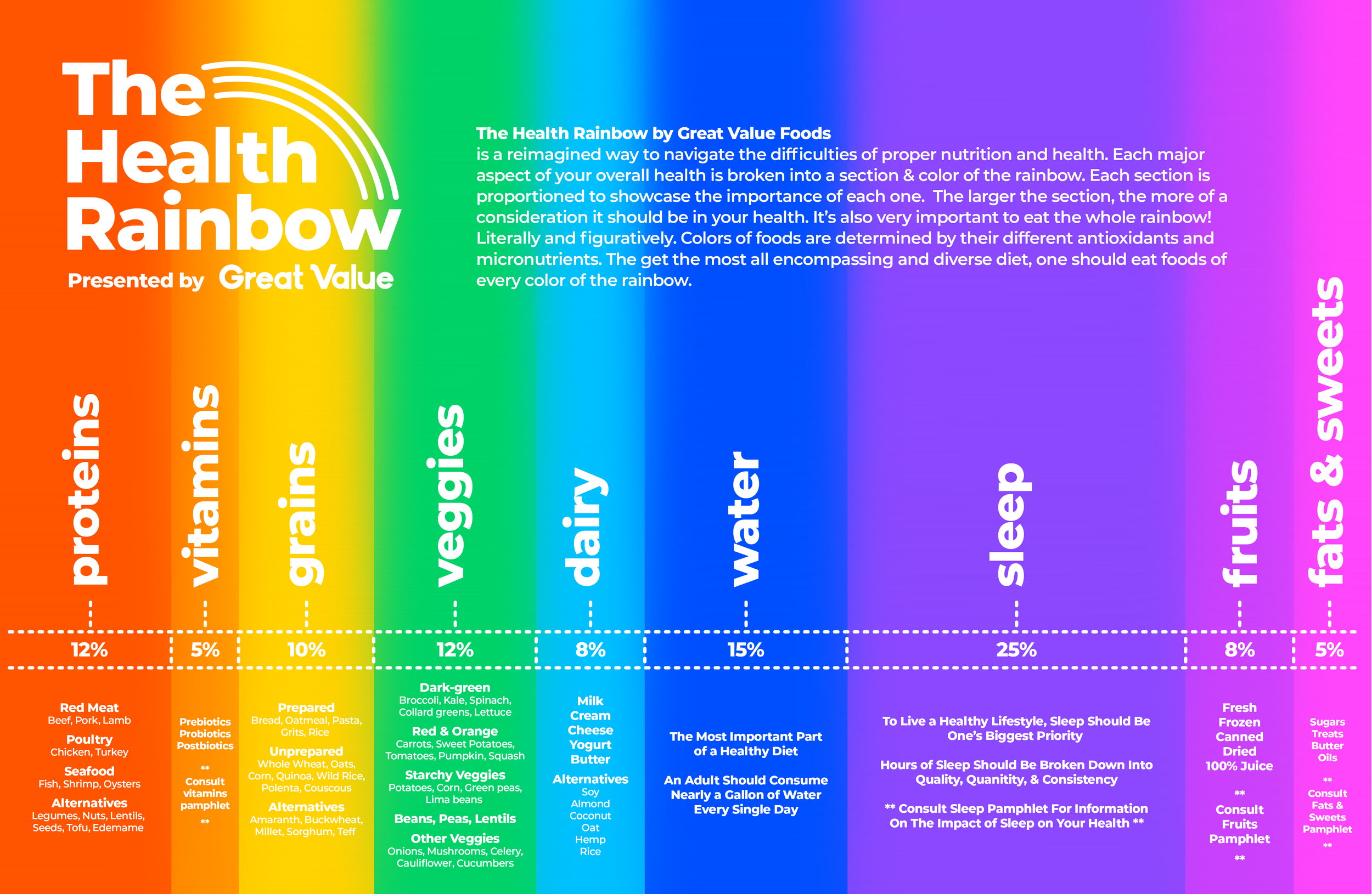
Designed to simplify one’s overall health and educate the average consumer on how to properly fulfill their diet and understand nutrition, “The Health Rainbow” divides each category of your overall health into a color on the rainbow. The larger the section, the more of a consideration it should be in your health. This infographic is a reinterpretation of the food pyramid to be a more accurate guide to navigating the complexities of health beyond only nutrition.
“THE HEALTH RAINBOW”
PHASE II
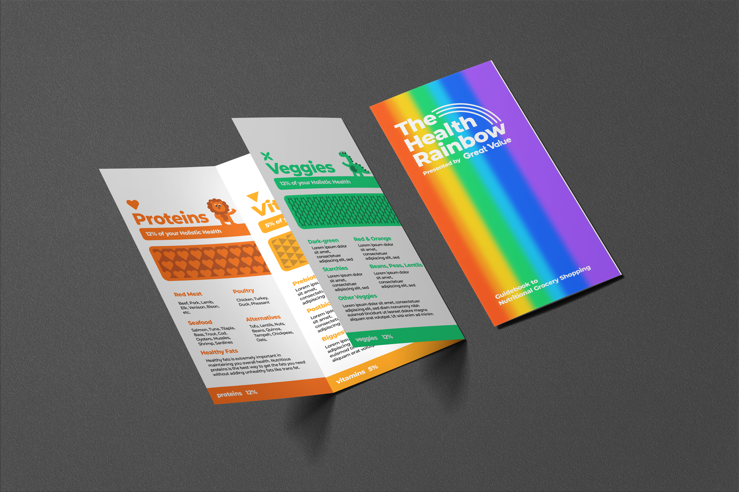
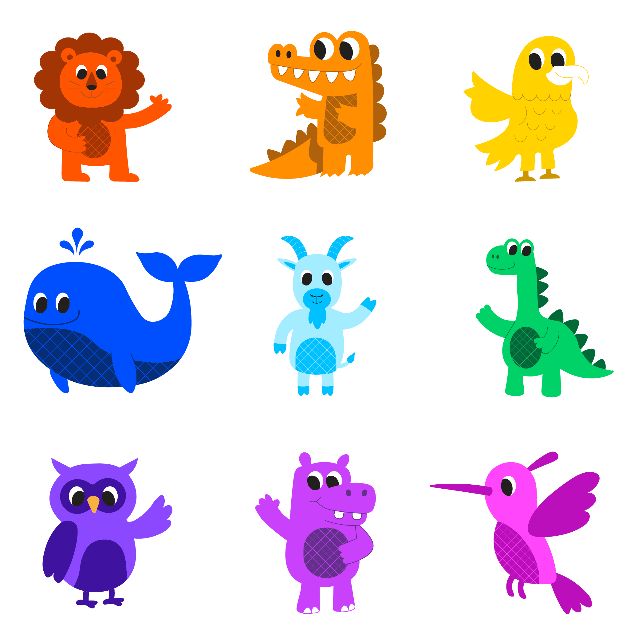
To further your knowledge on “The Health Rainbow”, this informational pamphlet does a deep dive into each category/color of your overall health. Through the use of color, patterns, icons, and mascots, each health group becomes its own little brand that brings familiarity to each group in the eye of the consumer.
INformational pamphlet
PHASE III
IMPLEMENT HEALTH RAINBOW INTO GREAT VALUE FOODS REBRAND
In order to promote people to utilize the new “Health Rainbow,” we implemented it into a rebrand of Great Value Foods. Walmart is perhaps the most accessible grocery store in the country so there is no better place to do this. I created a custom typeface for the word mark and development an entire brand guideline using all branding assets from the “Health Rainbow”.
PRIMARY LOGOMARK
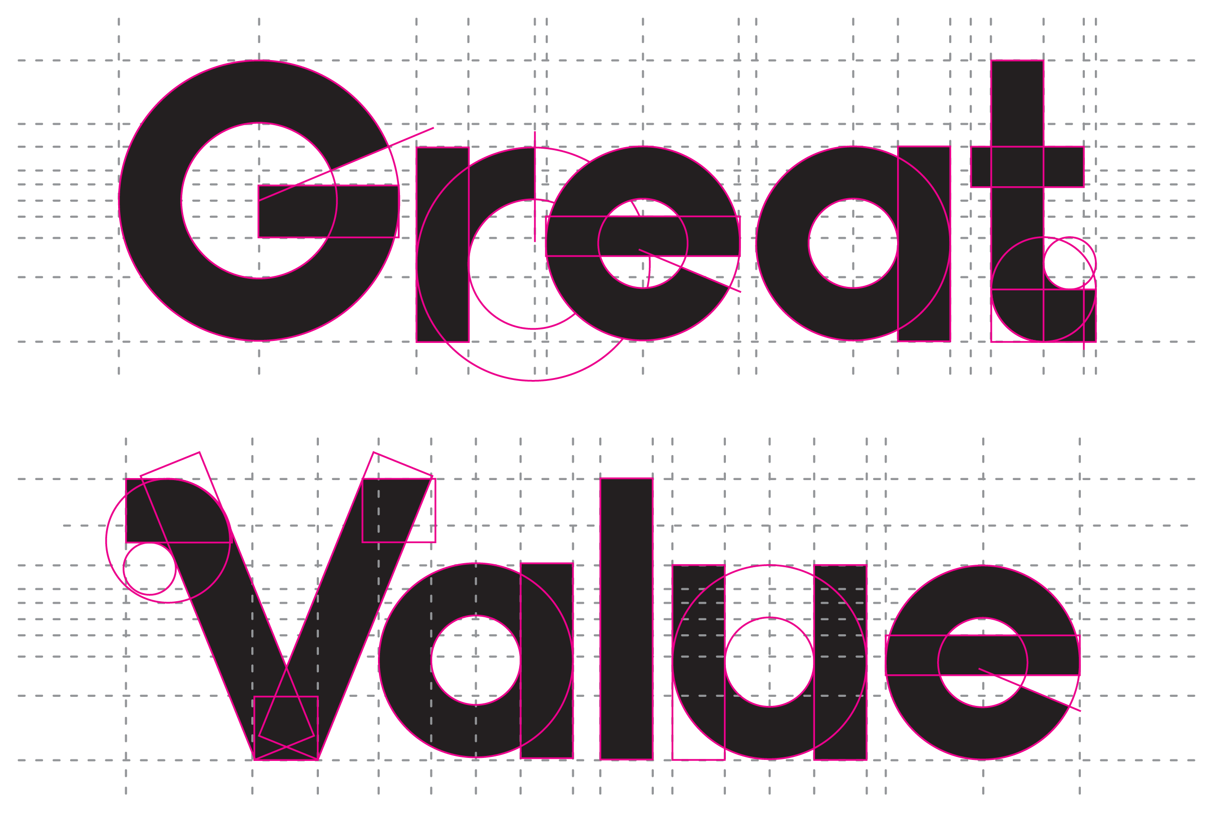
TYPEFACE DEVELOPMENT
ICONography
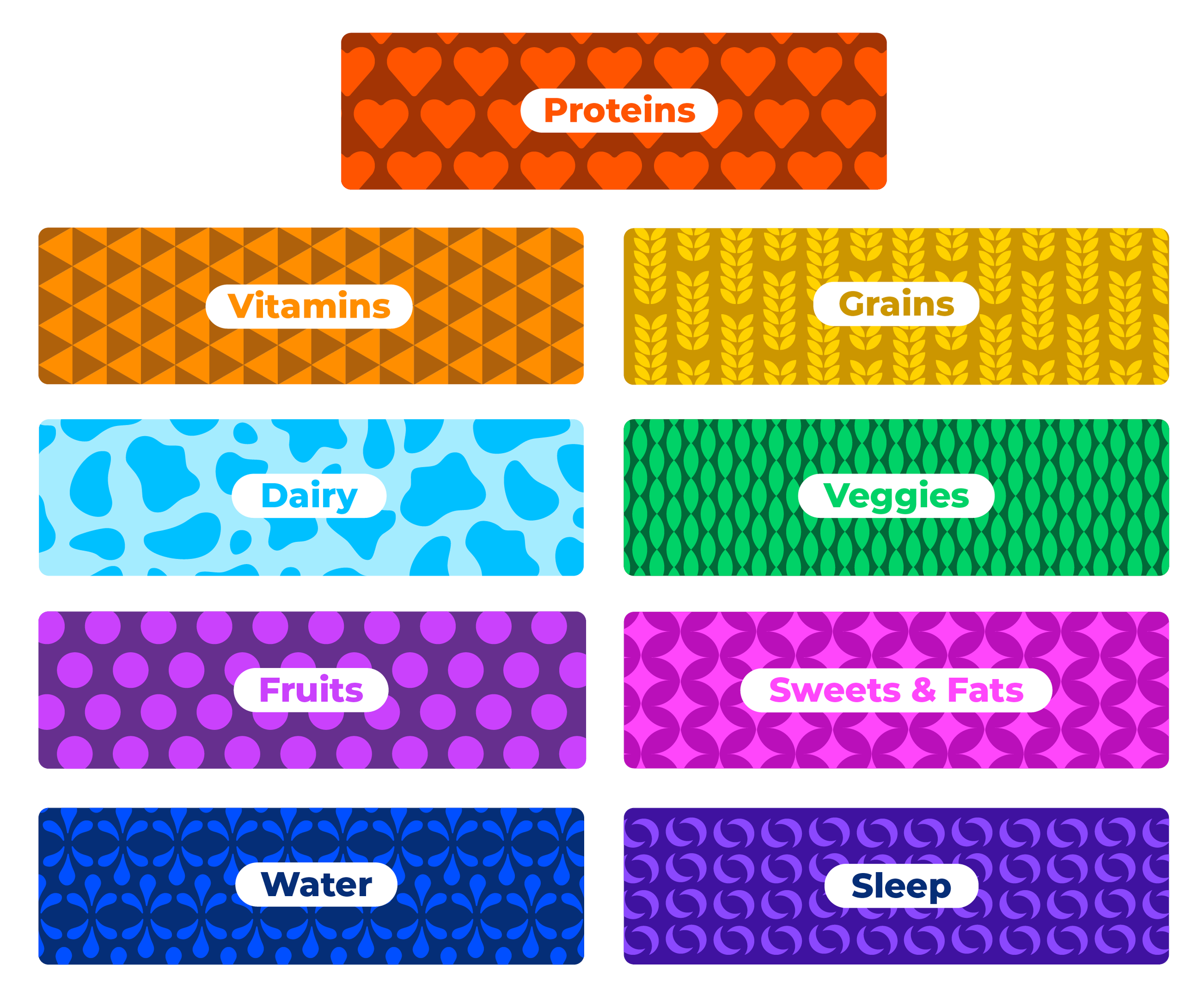
patterns
MASCOTS
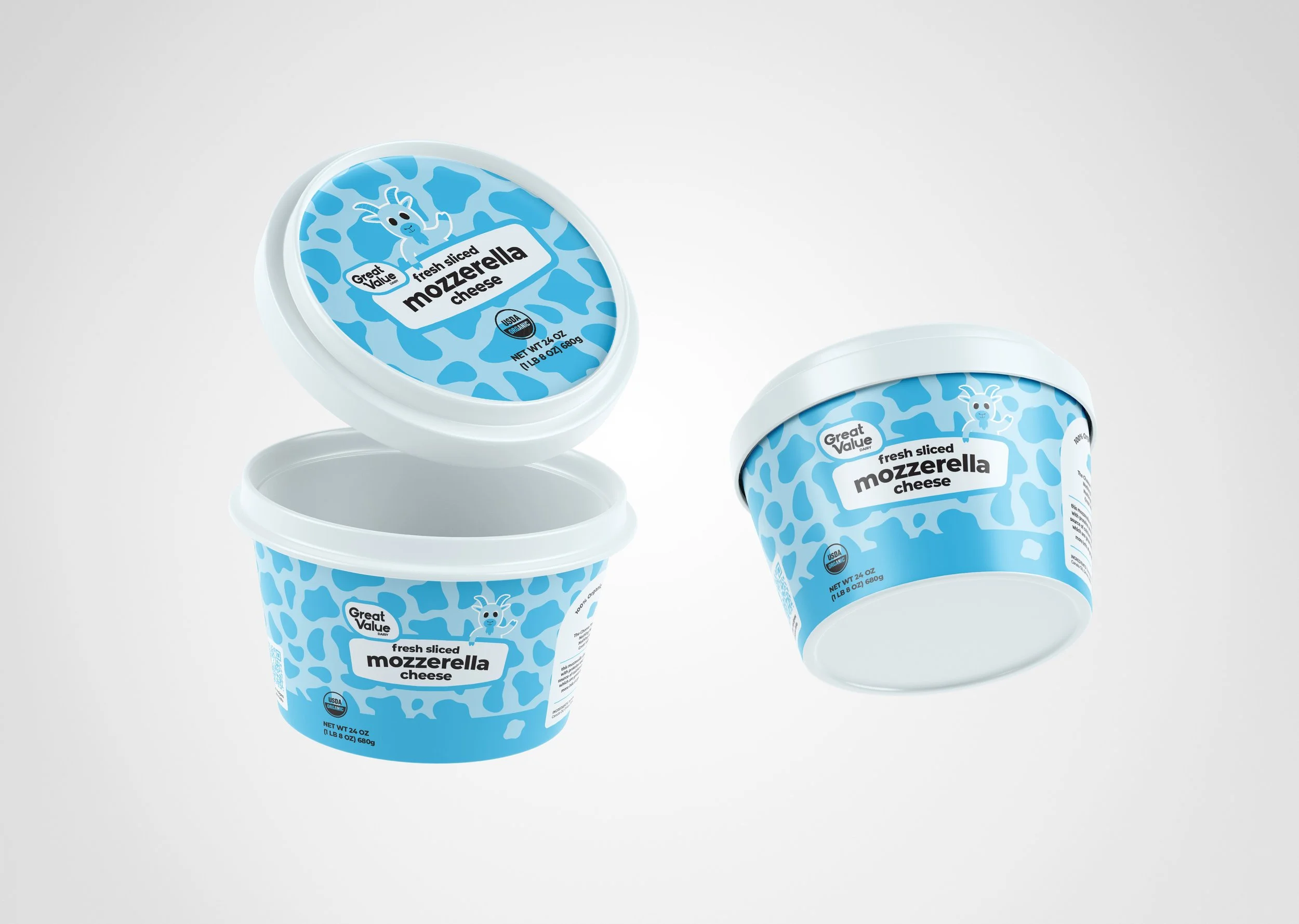
PHASE IV
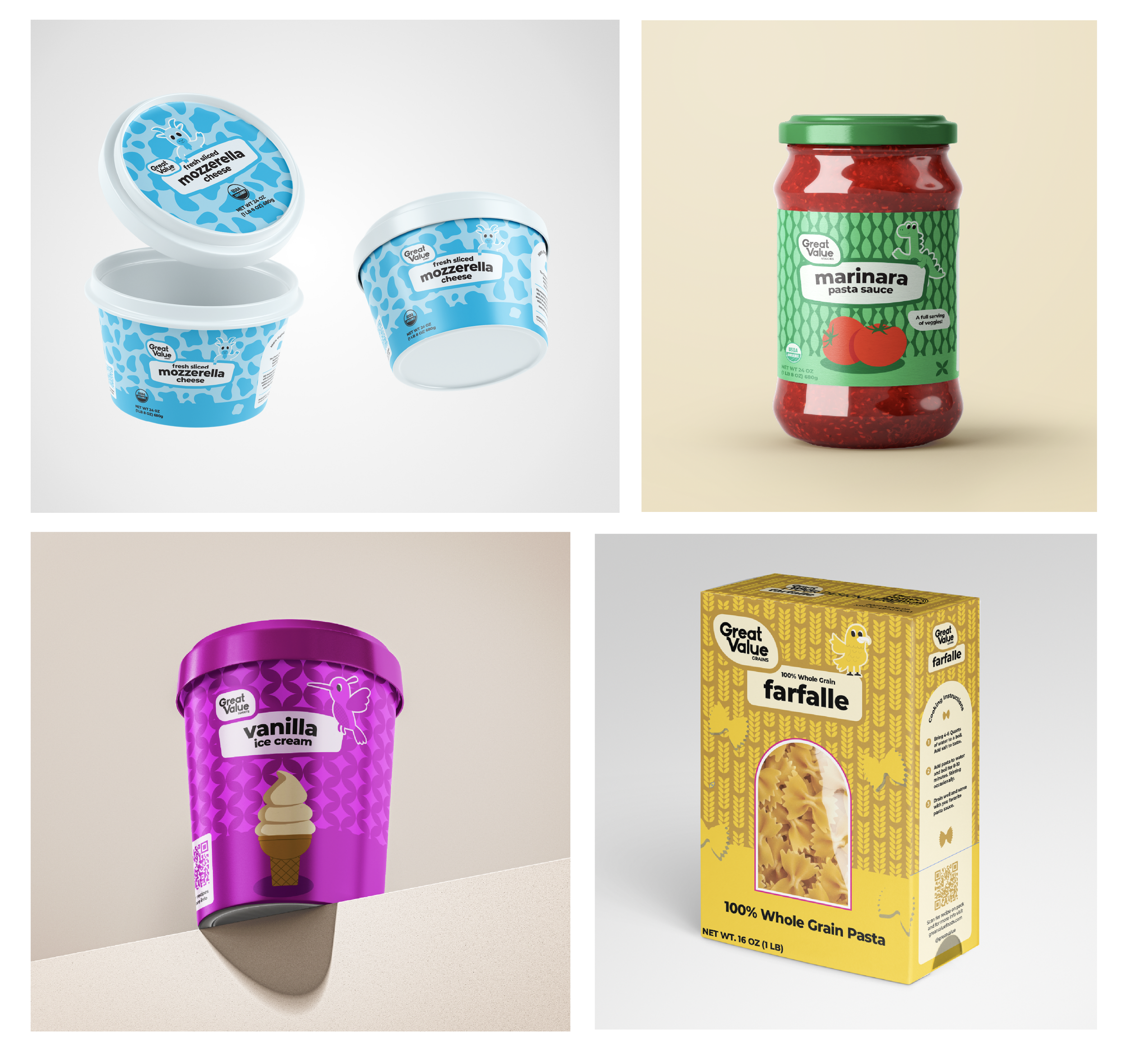
To showcase how this entire concept would work in an actual grocery store, I created four package design examples for each health group on the rainbow. This system allows people to simplify their grocery shopping with color coded boxes. Once your shopping cart is full of every color on “The Health Rainbow”, you know you’ve satisfied all aspects of your holistic health.